Aggiunta Piani
| Language: |
English • Deutsch • español • suomi • français • italiano • Nederlands • português • română • русский • 中文(中国大陆) |
|
Warning! This page contains outdated information. The release of Synfig Studio 0.64.0 introduced new terminology and this translated page needs to be updated according to original English text. You can help updating this page - see instructions here. Thank you! |
Contents
Introduzione
Nella lezione precedente, hai realizzato la tua prima animazione variando gli attributi base degli oggetti, come: posizone, colore, e dimensione. Questi, tuttavia sono raramente sufficienti per realizzare personaggi e oggetti avanzati. Per fare questo, Synfig usa i piani. Questi sono simili a quelli usati in altre applicazioni in cui sono usati per separare elementi differenti di un'immagine.
Tuttavia, i piani in Synfig sono diversi per almeno tre aspetti:
- Ogni oggetto, elemento, ed effetto ha un proprio livello.
- Puoi organizzare i livelli in gruppi gerarchici.
- Puoi usare i piani superiori per cambiare le proprietà (o bloccarle) dei piani sottostanti.
Come vedrai, i piani sono un'elemoento estremamente importante in Synfig, molto più che nella maggior parte dei programmi di grafica. Comprendere il concetto di piano è una parte importante per capire come lavora Synfig.
Disporre i piani
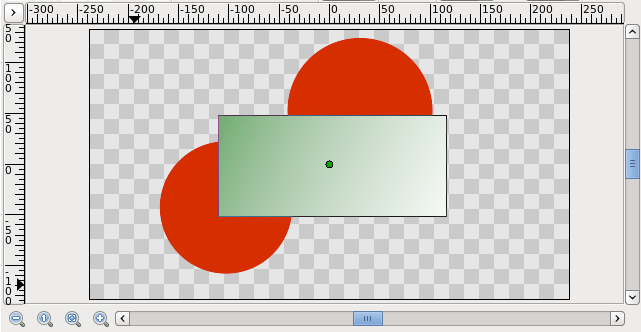
Vediamo ora un semplice esempio su come utilizzare due piani per creare un effetto di gradiente su un rettangolo.
Apriamo un file nuovo con durata 0. Non preoccupiamoci della linea temporale, per ora. Disegnamo dunque un semplice rettangolo con lo Strumento Rettangolo.
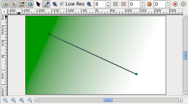
Clicca sullo Strumento Gradiente dalla Casella Strumenti, premi il tasto sinistro del mouse sulla tela, trascina per variare la direzione del gradiente e rilascia quando fatto. Noterai che un'altro piano verrà aggiunto nel Pannello Piani chiamato Gradienti. E' normale.
|
Nota Se non vedi un gradiente ma solo un colore uniforme, questo probabilmente vuol dire semplicemente che hai cliccato sulla tela senza trascinare il mouse. To fix that pick the Transform Tool, click into the canvas to activate the gradient's ducks. You need to grab the one you see and move it a bit until a gradient appears.
|
You now have a gradient, but it is not what you wanted: it spreads across the whole canvas. The goal was to have a gradient in the rectangle. So, let's fix this now.
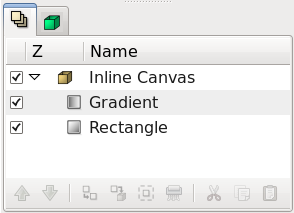
In the Layers Panel, select both the gradient and the rectangle layer. Then, right-click and select "Encapsulate" from the menu. The view of your Layers Panel should change now, showing a small box called Inline Canvas with an arrow in front. By clicking on the arrow you can expand the inline canvas to see its contents, your previous two layers: the gradient and the rectangle.
You can treat this layer like any other layer — move it around, duplicate it, copy and paste it. If you want to change the name of it to something more descriptive, just select the layer in the layer tab and click on its label. Then you just edit it in place. You can do this for ANY layer, and are strongly encouraged to do so.
Using locality
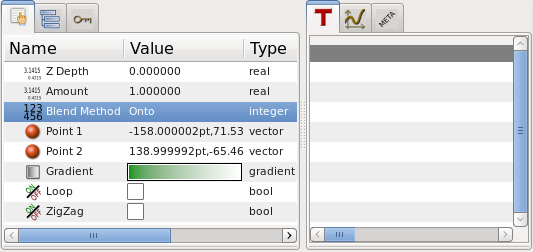
However, there is still a problem: the gradient still covers the whole canvas although we wanted it to be restricted on the rectangle. To do so, activate the gradient layer in the Layers Panel. Now go to the Params Panel (by default it resides in the bottom window), and search the attribute called "Blend Method". Double-click the entry and select "Onto" from the drop-down menu.
The gradient should now be restricted to the rectangle. Congratulations! You just made your first effect by interacting layers with Synfig.
If only for the additional organization, encapsulating layers into inline canvases dramatically improves the ease of use of Synfig Studio. But lots of programs can do this. The concept of scope as just demonstrated sets Synfig apart from other programs with layer hierarchies. The key point is that layer can only modify the data that it gets from directly below it. In other words, if you were to throw a Blur Layer on top of the layers inside the inline canvas we created, it would just blur them — anything under the inline canvas would not be blurred! Let's try it.
Using layers to modify other layers
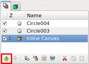
Make sure you have Inline Canvas layer selected and create two red circles. They will appear on top of Inline Canvas. Select Inline Canvas layer and use "Raise Layer" button in the Layers Panel to place it on top of the circles.
Now our inline canvas layer (with rectangle and gradient) is in front of those two circles.
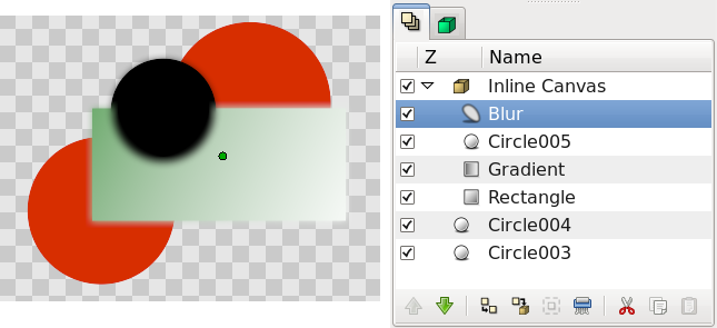
Expand the inline canvas to show its contents, and select the top layer inside of it (should be the gradient layer). This is where we want to insert the new layer. Create another circle filled with a black color. The black circle layer will be created over the gradient layer inside the inline canvas.
Now, right click on the black circle layer in the Layers Panel and a popup menu will appear. The first item in that popup is "New Layer". Inside of the "New Layer" menu, you'll see several categories of layers you could create, but what we want is a blur, so go to the Blurs category and select the "Blur" layer (so that would be "New Layer → Blurs → Blur").
Well, it blurred... but something is not quite right — the outside edge of contents of the inline canvas is still sharp. It is doing this because the blend method of the blur defaulted to "Composite" (you can change the default blend method for new layers from the New Layer Defaults section of the Toolbox). What we want is a blend method of "Straight". Just select the blur layer, and change the Blend Method to "Straight" in the Params Panel.
|
Note We will probably change the way that default blend methods are handled in the future — as the way it is currently handled seems to only create hassles like this.
|
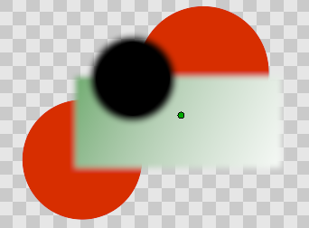
Ok, now we have all of the contents of the inline canvas blurred, but everything under it is sharp!
Digging further...
If you care to look into Synfig's main menu under "Layer → New Layer" you will note quite a lot of different possibilities for making layers. Several of them sound rather unusual, like "Transform → Rotate" for example. You can use this to add new attributes to your objects. And just like other, basic attributes in the previous animation tutorial, you can change them to be different on certain keyframes. Synfig will take care of interpolating the steps in between.
For example, you could create a some shape and add a Rotate Layer over it. Combine this with the lesson learned in the last tutorial and you can create a rotating effect. This technique is used for creation of Cut-out Animation.

