Doc:Adding Layers/es
| Language: |
English • Deutsch • español • suomi • français • italiano • Nederlands • português • română • русский • 中文(中国大陆) |
|
Warning! This page contains outdated information. The release of Synfig Studio 0.64.0 introduced new terminology and this translated page needs to be updated according to original English text. You can help updating this page - see instructions here. Thank you! |
Esta página debería estar escrita en Español. Por favor ayúdanos a traducirla!
Nota para el lector: Esta sección todavia no esta terminada, por favor sea paciente.
Introducción
En el tutorial anterior, hiciste una primera animación sencilla al cambiar los atributos de objetos primarios, tal como: posición, color, y tamaño. Estas formas simples, sin embargo, son casi insuficientes al momento de crear personajes u objetos avanzados. Para ello, Synfig utiliza Capas. Estas son similares a las capas que se conocen en otras aplicaciones para dibujo, como por ejemplo GIMP.
|
No obstante, las capas de Synfig se diferencian de las capas comunes en, por lo menos, dos características:
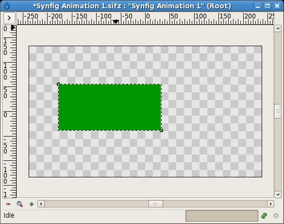
Hacerlo es bastante fácil. Observemos un ejemplo sencillo.
|
Combining Layers
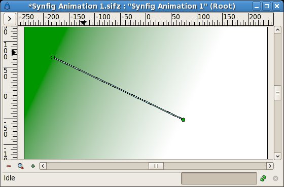
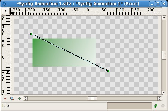
Now there are two ways to proceed. In the first way, pick the gradient tool from the Synfig Toolbox, and click into the canvas once. You should note that another layer was added in the Layers Panel called 'Gradient'. This is nothing special. If you see no gradient but just a plain color, pick the normal tool, click into the canvas to activate the gradient's ducks. You need to grab the one you see and move it a bit until a gradient appears.
You now have a gradient but it is not what you wanted: It spreads the whole canvas and the goal was to have a gradient on the rectangle. Let's fix this now.
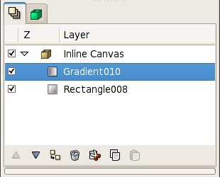
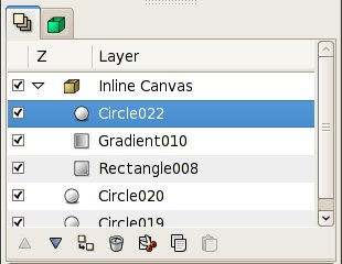
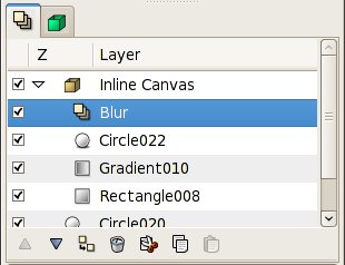
Select the gradient and the rectangle layer in the Layers Panel. They should appear with a blue background now. Then, context-click (ie. right-click on Windows and Linux) and select 'Encapsulate' from the menu. The view of your layer tab should change now, showing a small box called 'Inline Canvas' with an arrow in front.
You can treat this layer like any other layer -- move it around, duplicate it, copy and paste it. By clicking on the arrow you can expand the inline canvas to see its contents, your previous two layers, the gradient and the rectangle.
If you want to change the name of it to something more descriptive, just select the layer in the layer tab and click on its label. Then you just edit it in place. You can do this for ANY layer, and are strongly encouraged to do so.
Using locality
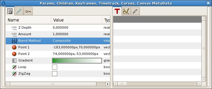
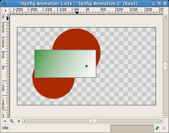
However, there is still a problem: The gradient still covers the whole canvas althought we wanted it to be restricted on the rectangle. To do so, activate the gradient layer in the Layer tab. Now go to the Params Panel (by default a tab in the Params-Children-Keyframes window), and search the attribute called 'Blend Method'. Double-click the entry and select 'Onto' from the appearing drop-down menu.
The gradient should now be restricted to the rectangle. Congratulations! You just made your first interacting layers with Synfig.
If only for the additional organization, encapsulating layers into inline canvases dramatically improves the ease of use of Synfig Studio. But lots of programs can do this. The concept of scope as just demonstrated sets Synfig apart from other programs with layer hierarchies.
However, a layer can only modify the data that it gets from directly below it. In other words, if you were to throw a Blur Layer on top of the layers inside the inline canvas we just created, it would just blur them -- anything under the inline canvas would not be blurred!
Let's try it. Create two red circles and in the Layers Panel move them under the inline canvas. Now our inline canvas (with rectangle and gradient) is in front of those two circles.
Expand the inline canvas to show its contents, and select the top layer inside of it (should be the "Gradient" layer). This is where we want to insert new layer. Create another circle filled with a black color. Layer with circle will be created over the gradient layer inside the inline canvas.
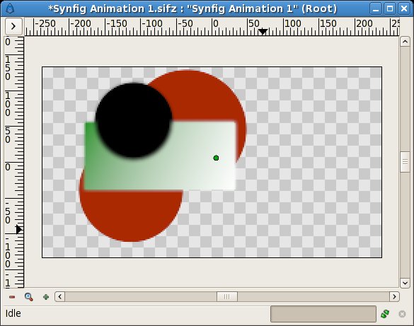
Now, right click on the layer with black circle in the Layers Panel and a popup menu will appear. The first item in that popup is "New Layer". Inside of the "New Layer" menu, you'll see several categories of layers you could create, but what we want is a blur, so goto the Blur category and select the "Blur" layer. (so that would be "New Layer->Blurs->Blur")
Well, it blurred... but something is not quite right - outside edge of contents of the inline canvas is still sharp. It is doing this because the blend method of the blur defaulted to "Composite" (you can change the default blend method for new layers from the New Layer Defaults section of the Toolbox). What we want is a blend method of "Straight". Just select the blur layer, and change the Blend Method to "Straight" in the Params Panel.
- NOTE: I will probably change the way that default blend methods are handled in the future--as the way it is currently handled seems to only create hassles like this.
Ok, now we have all of the contents of the inline canvas blurred, but everything under it is sharp!
Digging further...
If you care to look into Synfig's main menu 'Layer > New Layer' you will note quite a lot of different possibilities for making layers. Several of them sound rather unusual; 'Transform > Rotate' for example. You can use this to add new attributes to your objects. And just like other, basic attributes in the previous animation tutorial, you can change them to be different on certain keyframes. Synfig will take care of interpolating the steps in between.
For example, you could create a some shape and add a Rotate Layer over it. Combine this with the lesson learned in the last tutorial and you can create a rotating effect. This technique is used for creation of Cut-out Animation.

